Theater Mostaghel
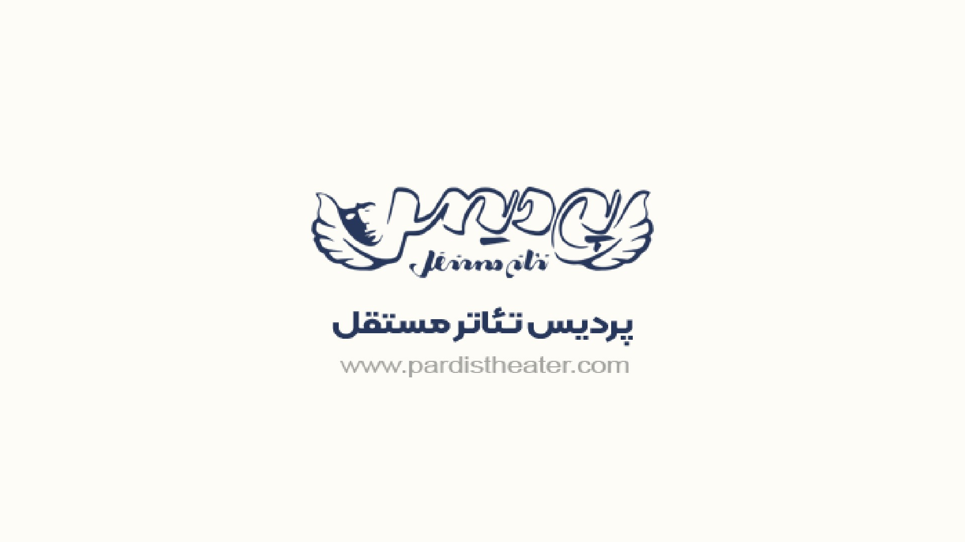
In meetings with the team at “Theatre Mostaghel”, we decided to shift the emphasis in the logo from the word “Pardis” to “Independent.” Subsequently, the word “Pardis” was entirely removed, and the project was redefined as “Independent Theatre”—one of the largest independent cultural and artistic venues in Mashhad.
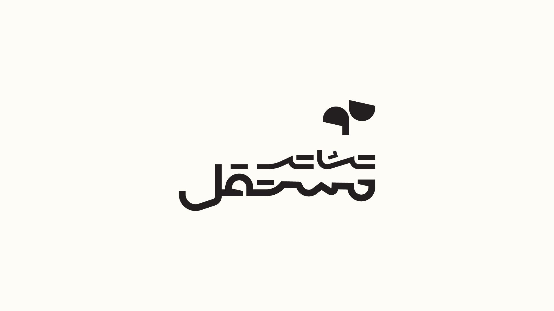
Given the nature of theatre, two core concepts served as our primary inspiration: madness and visibility. Based on this, we chose the triangle as the central visual element of the identity system. This triangle appears in constantly changing forms, always with unequal sides. Its irregular, dynamic geometry evokes a sense of controlled chaos, while simultaneously resembling a spotlight. Through this concept, parts of the logo are deliberately concealed in the absence of light, creating a visual dialogue between visibility and obscurity.
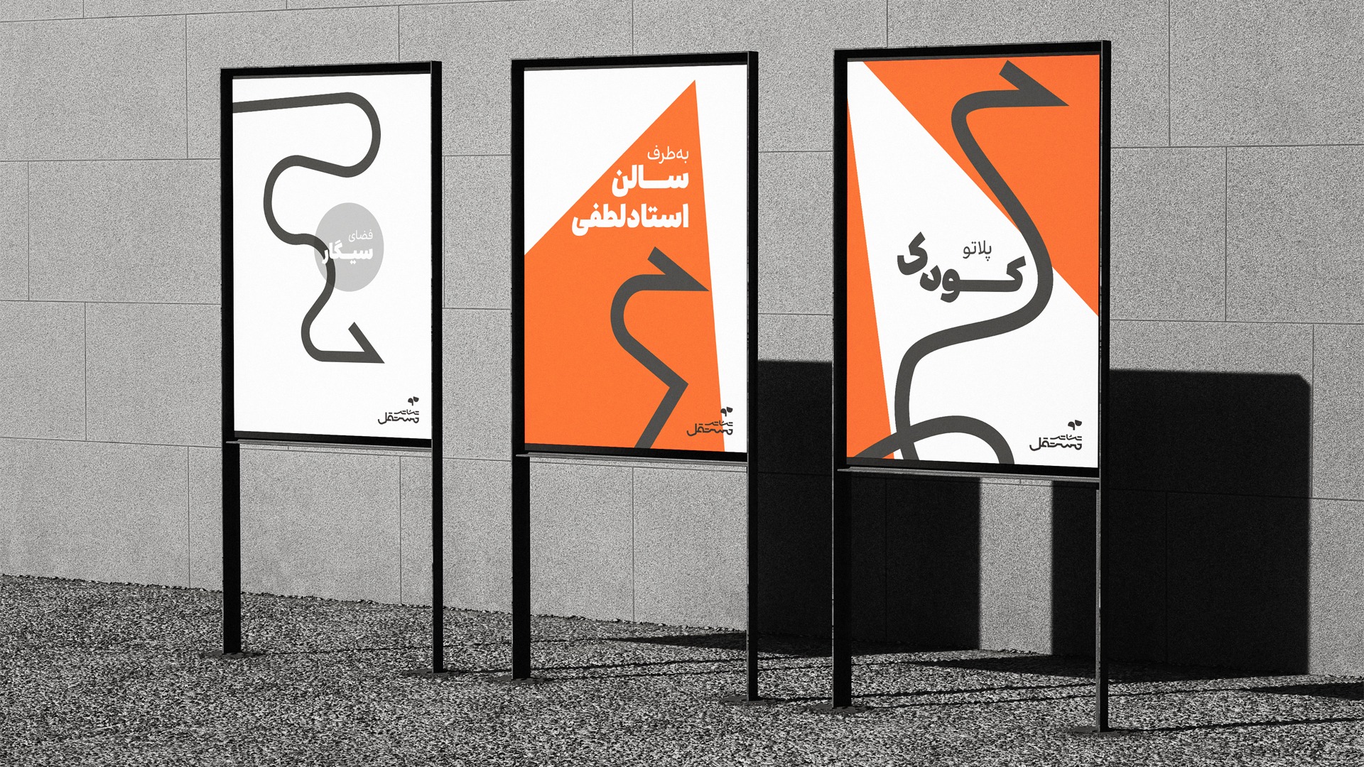
Across the broader visual identity system, we further developed these two principles—madness and visibility—into a more expressive language. We used freeform, unstructured lines with no predictable geometry, evoking a sense of movement, vitality, and freedom from constraint. Color also played a crucial role; bold and intense hues were employed not only to capture attention but also to reflect heightened emotional states such as excitement, intensity, and even disorder.
در جلساتی که با تیم «پردیس تئاتر مستقل» داشتیم، تصمیم گرفتیم تأکید در لوگو از روی کلمه «پردیس» به «مستقل» تغییر کند. در ادامه، کلمه «پردیس» بهطور کلی حذف شد و پروژه «تئاتر مستقل» آغاز شد؛ یکی از بزرگترین مراکز هنری مستقل در مشهد.
با توجه به ماهیت تئاتر، دو ویژگی اصلی الهامبخش ما بودند: دیوانگی و دیدهشدن. از همین رو، شکل مثلث را بهعنوان عنصر اصلی طراحی انتخاب کردیم. این مثلث، نه تنها هر بار متفاوت ظاهر میشود بلکه اضلاع نامساوی خواهد داشت؛ فرم نامنظم و پرجنبوجوش آن، حس دیوانگی را تداعی میکرد و در عین حال بیشباهت به نور موضعی نبود. با استفاده از این ایده، بخشهایی از لوگو را در غیاب نور پنهان کردیم تا بازی با دیدهشدن و پنهانشدن در طراحی نمایان شود.
در سایر بخشهای هویت بصری مجموعه نیز تلاش کردیم این دو ویژگی اصلی، یعنی دیوانگی و دیدهشدن، را به شکل عمیقتری نمایش دهیم. از خطوطی بیقالب و آزاد استفاده کردیم که ساختاری مشخص و قابل پیشبینی نداشتند؛ این خطوط، حس سرزندگی و عدم محدودیت را به مخاطب القا میکردند. رنگها نیز نقش مهمی ایفا کردند؛ رنگهای تند و جسورانه، نهتنها توجه را به خود جلب میکردند، بلکه احساسات شدیدی مانند هیجان، شور، و حتی آشفتگی را بازتاب میدادند.

July, 2023
Design in Studiobekr
Mission done